When creating a learning experience, the sophistication of its design helps to build credibility with your learners. Simply put, your learners take their learning more seriously when it’s clear that significant thought and effort went into its design.
A key element of great learning is the selection of appropriate and compelling visuals. While custom photography gives you the greatest control over the relevance and design of imagery in your learning, it’s often a luxury that designers working under tight deadlines or budgets (or both!) can’t afford.
We’ve created this Guide to Selecting the Right Stock Photography for Your Learning because we know that stock photography can enhance the overall learning experience and help deliver more-effective learning experiences.
Good design makes learners believe your training is more effective
Good photography doesn’t replace good learning content; rather, good design (including well-chosen photos) can improve the effectiveness of your training.
In 1995, researchers at the Hitachi Design Center studied the relationship between aesthetic appeal and users’ perception of an ATM’s ease of use. They described the findings of their study as the Aesthetic Usability Effect. They found that there’s a stronger correlation between aesthetic appeal and a user’s perception of a system’s functionality than there is between aesthetic appeal and actual functionality. Basically, when a system is beautifully designed, users think it works better.
Richard Mayer’s research into multimedia learning also demonstrates that people learn better from a combination of words and pictures than from words alone. But not just any picture will do. According to his coherence principle, imagery only supports more effective learning when it’s relevant.
Taking the time to design a course well — and to select the right stock photography — works to engage your learners and improve their learning experience.
So how do you find good stock photos?
Start with a good source
There are lots of stock photography websites out there. The best ones have moderators who evaluate and curate the content they offer. We subscribe to Getty and we also really like Unsplash, which is a great free option. Always make sure you have creative rights to use the photos you select and that you give appropriate credit for free resources.
Build off of your design aesthetic
When we design our learning, we solidify the learning concepts and identify a design aesthetic before getting into the nitty gritty details, like good stock photo selection.
The course topic should play a big role in the mood of the photos you select. Think about how photography represents your subject matter. Should it be whimsical, serious, futuristic, ethereal, inviting, fresh?
Establishing your color palette based on branding needs or course themes will help you hone in on styled stock photography that feels like it was taken specifically for your training.

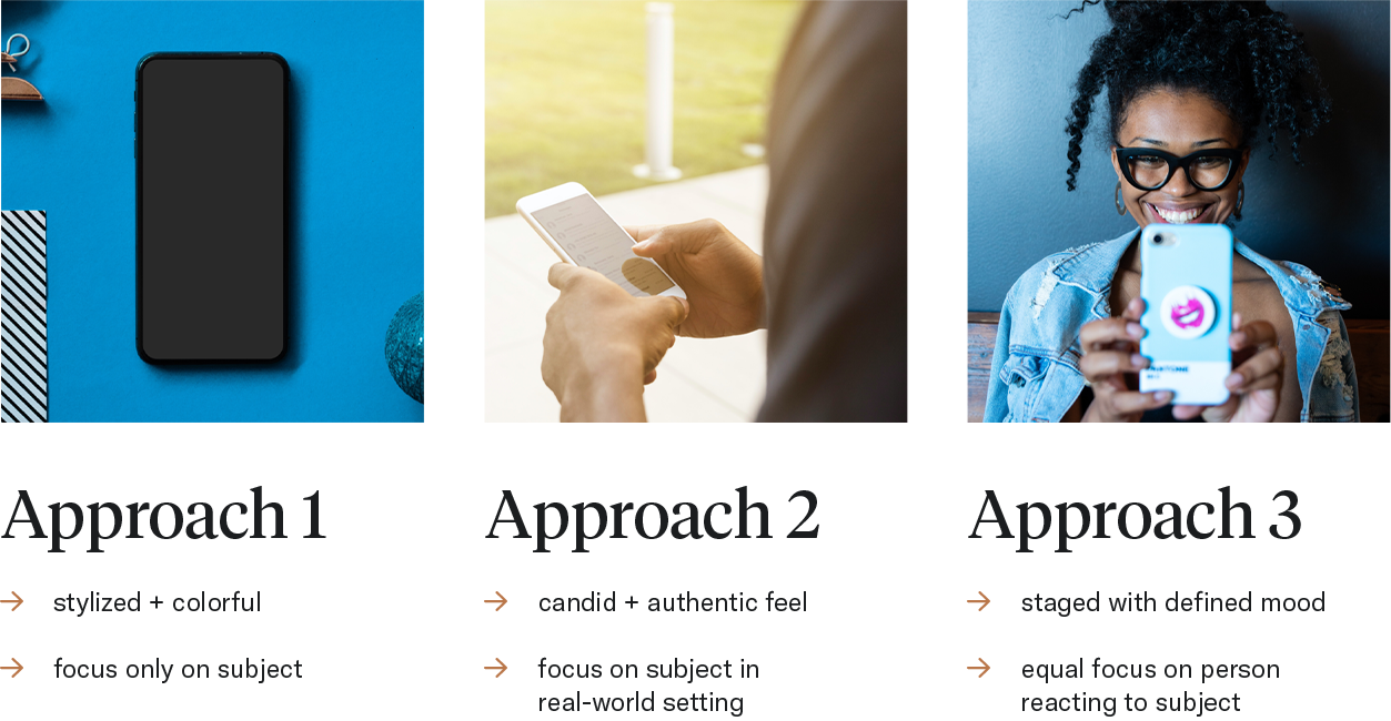
Prioritize consistency for good stock photos
Pick a style and stick with it. If you include obviously staged images, don’t mix and match with candid-looking shots; if you start with naturally lit images, don’t include stylized lighting for other photos. One consistent stock style is better than mixing different styles.
One way to make sure your photos are cohesive is to put together a mood board before purchasing all of them. Many stock photography websites offer comp images. You can find your images, place the comp versions in the course, and review them in context to see how they work together. Then, once you’ve finalized your selections, you purchase the images.

Think about important search criteria
When searching for good stock photos, the most important factor to consider (as we learned from Richard Mayer) is relevance to the learning concept you’re teaching. There are several other things to keep in mind that will help you find the right image.
Think about the dimensions of the space the photo needs to fit into and how you could crop to utilize a portion of an image. Consider point of view: think about how a flat lay, first-person, or second-person view can draw the learner in or give them perspective they need to understand a concept. Think about how depth of field can add atmosphere and help the learner focus on what you want them to see.
Make sure any people in the photos are representative of your learners. The style of dress, facial expressions, and demographics of the people in your images should match your audience and your learning approach. There are so many reasons why it’s important to select images that reflect a diverse range of people, not the least of which is that learners are more engaged when they see themselves represented in the content. Diversity can often feel forced or inauthentic in stock photography. To avoid this, try to use many different photos that represent many different individuals, rather than one photo that includes a “diverse” group — this type of picture is easy to spot as staged.
When we’re on the hunt for the perfect image, we refine our search terms based on the photos that feel like they’re on the right track. You can use features to view similar images — and a stock photography website can give you the option to view additional images from the same series or photoshoot. We don’t tend to use filters for things like orientation, because they may exclude images that would work great with minor editing. We prefer to cast a wide net so we can select from a greater variety of photos.
Make small edits for big effect
The stock photo you download from a stock photography website doesn’t have to be the final photo you use in a course. Making some small tweaks can go a long way toward making your images cohesive and improving your learning design.
We sometimes crop photos to fit the dimensions of our authoring tool, apply a blur filter to shift learners’ attention, adjust colors to align with our palette, or adjust contrast and apply color overlays to place text over photos.

We use Photoshop to edit images, but you don’t need to be a Photoshop wizard to achieve similar results with your eLearning stock photos. There are some great free and easy-to-use tools out there, like Pixlr or Photopea.
Good stock photos: the bottom line
Great photography conveys emotion. The reason a lot of stock photography looks and feels “flat” is that the photographer who took the image doesn’t have any context for how the photo will eventually be used.
Your job as the learning designer is to select the image that best conveys the learning principle and the right emotion. When you pick images that check those two boxes and maintain visual consistency, they elevate the overall design of the course and improve your learners’ experience.
Love what you’ve learned about good stock photos?
Download Maestro’s checklist for selecting the right stock photos and never pick a cheesy photo again. Fill out the form, then add the cheat sheet to your desktop or print it off and hang it up for easy reference!