It’s the Timon to our Pumbaa. The peanut butter to our jelly. We don’t go anywhere without our instructional design storyboard template—and neither should you! Not sure where to start with it? We’ve cracked the code on storyboarding for instructional designers. Download our free template and have it handy to learn how to make the most of this powerful tool.
The Ultimate eLearning Storyboard Template
At Maestro, we’ve thought a lot about our eLearning storyboard template, and we’ve distilled that thinking into a simple, yet highly usable, document that’s been tried and tested in hundreds of learning projects we’ve worked on. We’ve found that a great storyboard format has three qualities: it’s simple, it’s scannable, and it’s adaptable. Want to steal our tried-and-true template for your own eLearning development process? It’s all yours!
Get the template→Make the storyboard yours
Storyboarding for instructional design isn’t limited to eLearning courses. Different learning formats call for minor tweaks to our storyboard template. Our base template has four columns—this format is great for narrated and facilitated learning experiences and video scripts. For narrated courses, like those built in Articulate Storyline, and video scripts, our template is ready to go right out of the box. For facilitated sessions, like ILT (instructor-led training) and vILT (virtual ILT), we change the “voiceover” column label to “facilitator notes” and voilà! It’s an ILT storyboard!
We build loads of eLearning courses in Articulate Rise. All it takes to tweak our storyboard template is a quick “delete column” for the voiceover column. Yes, it’s that easy! We also use this format for printable and digital participant guides. And both versions knock it out of the park on custom simulations that turn L&D heads.
We wouldn’t want job aids and other copy docs to feel left out, so we even have a version for those. A two-column storyboard gets the job done (so repeat “delete column”), and we like to use “Location” and “Copy” for our two headers. We use the first column for document-position descriptions, type labels (think “footer” and “callout”), section subheadings, design notes, and/or project labels, such as A and B, for example. There’s no right or wrong here. We tweak how we use it to fit the specific resource we’re creating.

What are you designing? Rename the column headings. Remove what you don’t need and add what you do. Make it work for you and your moment.
Let the storyboard do the heavy lifting
Storyboarding should make the instructional designer’s life easier. If you’re starting with an outline, a storyboard is the bullet train to your course destination.
Eliminate blank-page syndrome
MasterClass and Medium are filled with tips on overcoming writer’s block, aka “blank-page syndrome.” #iykyk—right, instructional designers? Storyboarding for instructional design can serve as a remedy for writer’s block. Transferring your outline into storyboard format is almost too easy, but once it’s done, you’re no longer staring at a blank page. The course copy all but begs to be written.
Get efficient
Storyboarding for instructional designers might feel like an extra step (be honest: you’ve skipped it—we all have!), but it’ll usually make your process more efficient. Pinky promise!
Spec out everything before adding final copy
It’s tempting to hit the ground running, putting pen to paper. But the more you can spec out your storyboard, the better off you’ll be when you start filling in the actual course copy. Consider the following elements—if your course will have them—and create them within the storyboard before you draft any actual copy:
- Table of contents / intro page
- Sections and/or chapters
- Title and any other recurring slide formats (ILT/vILT)
- End-of-course assessment
- Summary page
Create a shell for the course’s structure
Now, don’t brush this off as too basic: one of the very first steps of every storyboard for us is literally copy+pasting each outline item into our storyboard. The top-level points become our chapter (or section) titles. Level-two items become headings, and level three, subheadings.
If you’re using Google Docs, enable the outline view in the left panel. Once you finish populating the storyboard, the outline panel should nearly match the top levels of your content outline.
Prevent costly rework
Rework any structural issues—reordering or combining chapters and shifting topics between chapters. While the translation from outline to storyboard is often 1:1, we often adjust “in the air” as we go. As the storyboard starts to take shape, it gives you another 30,000 ft view of the content, and it’s much easier to adjust for structure sooner rather than later.
Storyboard to the max
So how does this storyboard—or “SB,” as we like to call it—work, anyway? Let’s dig deeper into the nuts and bolts of storyboarding for instructional design.
Components
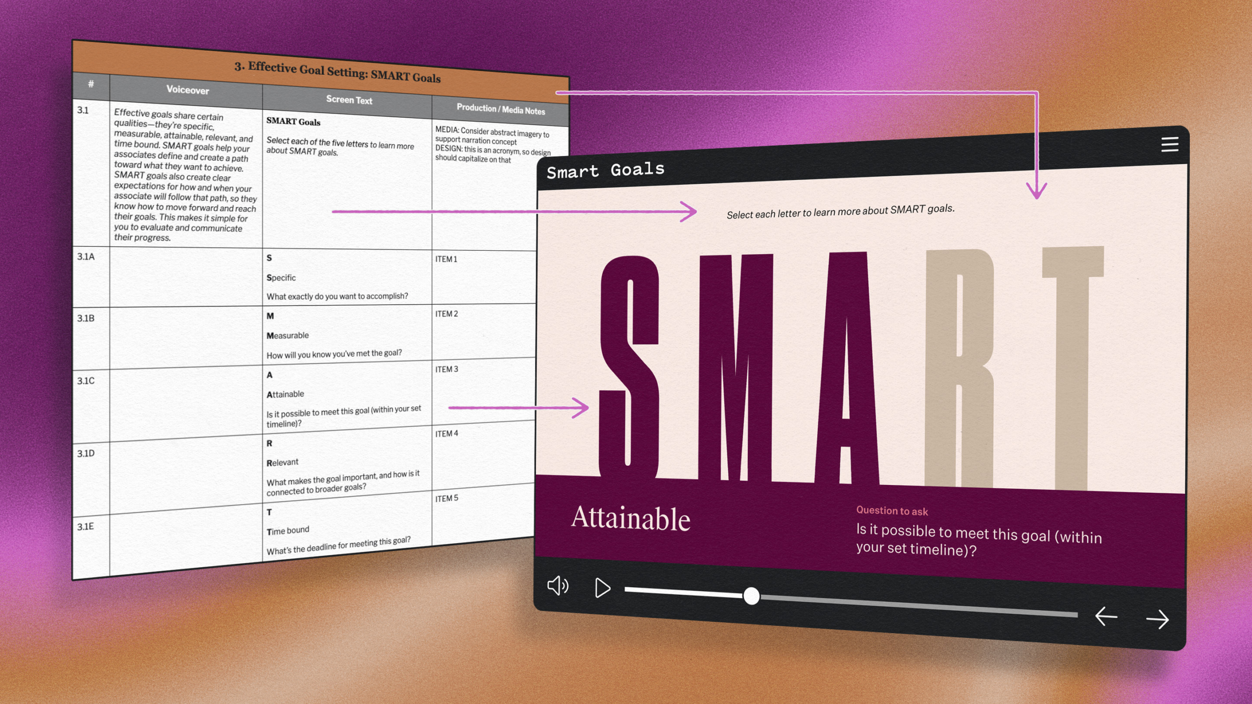
An especially useful feature of our instructional design storyboard template is being able to break sections of content into granular pieces. This can help reviewers envision the course before it’s designed—saving time, money, and rework effort down the road. We use each row (our storyboard is a series of tables) very intentionally to separate out each layer of content. An eLearning storyboard might include the following:
- Navigational text: text that guides the learner on how to navigate the course
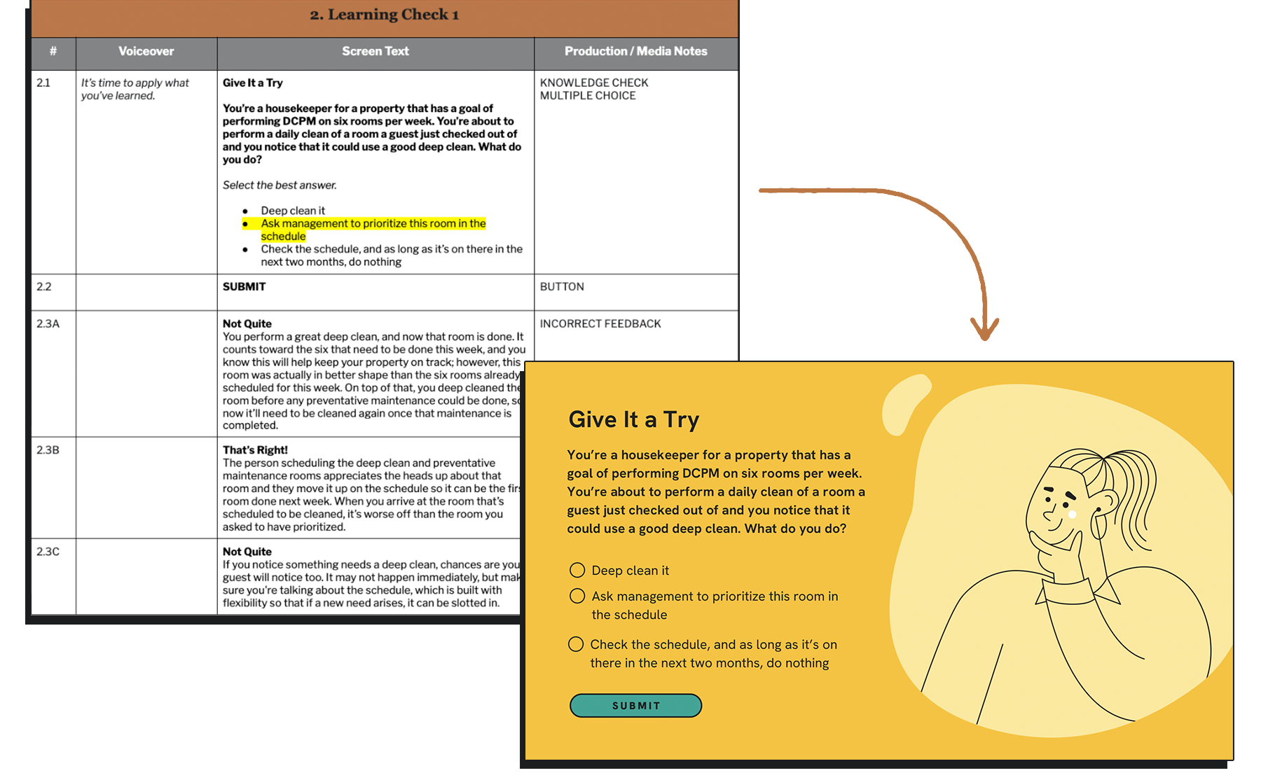
- Feedback: text that helps the learner understand their correct or incorrect response to a knowledge check or interaction
- Component layers: any text or media that the learner will read or interact with in a given view (within a pop-up modal, a dropdown or tab window, a button, an image caption, or more)
For Rise eLearning storyboarding, we developed a component template library with best practices for storyboarding Rise components. Join our Community to be the first to know when we share that resource.
Pushing the boundaries in Articulate Rise
Articulate Rise has a solid collection of components, and we use the storyboard to push the limits on those components. Whether we’re combining components to create a themed motif within a series of courses, repurposing a component for an outside-the-box use, or really unleashing our learning design by using the Mighty! Chrome extension we built to help learning designers everywhere supercharge their Rise courses, our storyboard template is with us every step of the way.
 Using an eLearning storyboard prompts innovative solutions that serve the content—and ultimately the learner.
Branching
Scenarios are a powerful learning tool, and one of our favorite approaches for learner engagement is branching. By creating a storyboard for eLearning, instructional designers can create a clear map for a choose-your-own-adventure learning experience that lets learners practice applying their understanding to relevant scenarios.

Streamline collaboration
A storyboard may start with an instructional designer, but it has a far reach. Internal reviewers, stakeholders, SMEs, visual designers, media producers, and developers may all review or reference the storyboard at some point in the process. This is a great place to hash out terminology, wording, meaning, procedures, media needs, calls to action, continuity, and editorial style.
Placeholders
While the end goal is to have all course copy buttoned up in the storyboard, experience tells us that isn’t always realistic. The storyboard is a great place to house placeholders so nothing falls through the cracks and it’s clear what the course is still waiting on. And yes, literally, we usually add “[placeholder]” to indicate text or content we’ll add later, and if we want it to stand out, we highlight it, just to be safe—because who wants to end up with a forgotten “[placeholder]” in their final copy—we’ve all seen it happen!
Highlighting
Storyboarding for instructional design is a complex process, but we try not to over-codify the document—we want to keep it simple and clear. But sometimes we highlight words or rows to communicate between collaborators on some of the following:
- Media needs
- Placeholder copy
- Open questions
- Digital download
- Problem spots, like copy that’s at too high of a reading level or instances of terminology that needs to change
Numbering
Our instructional design storyboard template includes a number column. This gives us a system for cross-referencing in our collaboration and, in some cases, for identifying media assets that pair with specific course content. Here’s what we do:
- For ILT/vILT and participant guides, we number the rows to match the course slide numbers.
- For video scripts, we number them according to scenes and sub-scenes.
- For narrated and self-paced eLearning courses and simulations, the number to the left of the period represents the chapter number, and the number to the right represents its order within the chapter. For interactive components, we use letters to denote layers.
Seat time
Part of the magic of storyboarding for instructional design is that everything you need to estimate your learning experience’s seat time also lives within the storyboard. For ILT/vILT, we estimate each slide and combine for a total. For eLearning courses, we developed a seat-time calculator that takes into account the amount of on-screen text (or the amount of VO), learner reading speed (or VO speaking speed), the number of interactions and knowledge checks, video and/or audio-clip length, and branching, feedback, and any optional content. You can validate these seat times once the actual course is built, but it’s more efficient to add or trim time while you’re still in the storyboarding phase.
Storyboarding can be an instructional designer’s secret weapon. It’s a natural yet powerful step between a content outline and a designed-out course.
Swap storyboarding strategies with our Maestro Community
Join other IDs in discussing strategies and ideas in a private, online (and free!) community.
Join the Community→