When you’re a learning designer, you’re making magic happen all day long. Whether you’re illustrating a set of characters or creating brand cohesive course components, you need the very best learning design tools at your disposal to make great learning happen.
What tools are you using most right now? Are you up-to-date on the latest tools out there and how to make the most of them?
Learning designers are changemakers and innovators—they’re the ones in the trenches using their creativity and design chops to bring interactive learning projects to life. There are plenty of resources already out there about the top instructional design tools (we have plenty to say about that, too!), but it’s just as important to remain on the cutting edge of design technology in order to make great learning happen.
So, what tools are creating the most buzz in 2024? Here’s a roundup of the learning design tools that our Interactive Design team loves and why you should give them a try, too.
1. Articulate 360
Of all the course development tools out there, the Articulate 360 suite is our go-to for developing beautiful, responsive courses. Articulate 360 includes both Rise 360 and Storyline 360, plus a slew of other eLearning design software apps. Articulate 360 delivers pretty much everything you need for course development in a single subscription. And it’s not only our preferred authoring tool—it’s also what our clients request most.
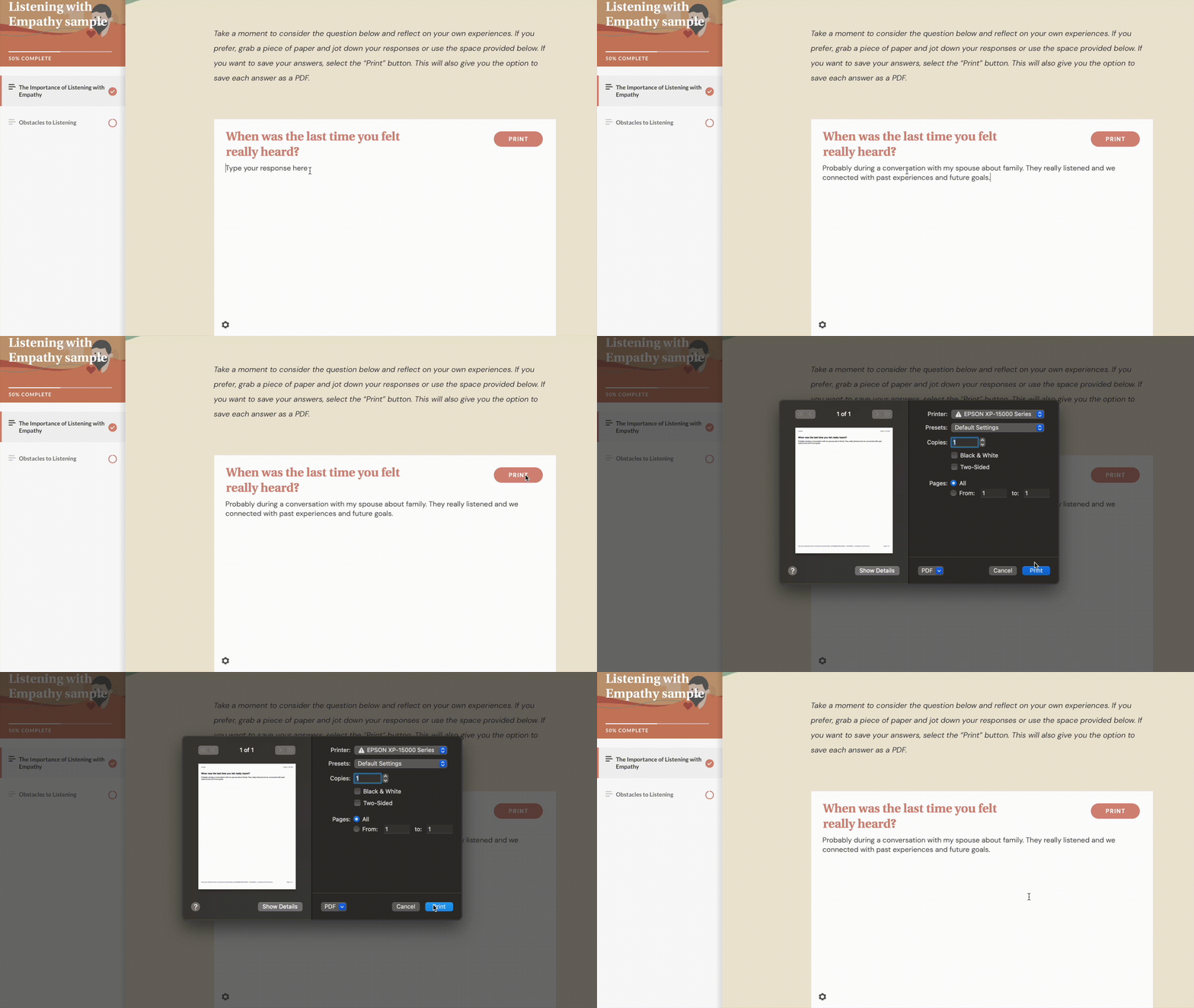
Articulate 360 has a modern, user-friendly interface that makes learning accessible and functional. For example, courses in Rise use component-based learning and customizable blocks to deliver quizzes, assessments, and multimedia content that work on all kinds of devices.
We’ve been working in Rise and Storyline long enough to become experts in what’s possible in both tools—whether that’s unique ways to customize components or workarounds to make an accessible Rise course. Another reason we love authoring eLearning with Articulate? The entire suite of tools work seamlessly with one another, ironing out a lot of the usual kinks of course development. We’ve even used Storyline interactions inside of Rise to accomplish an activity that is beyond Rise’s capabilities.
2. Mighty
While we’re on the subject of going beyond Rise’s capabilities, allow us to introduce you to Mighty—a no-chode Chrome extension that gives you more flexibility and creative control when designing eLearning in Rise. Developed by our very own team here at Maestro, Mighty was created by Rise users for Rise users.
We’ve been using Rise to design beautiful, responsive eLearning for years. Like we said, it’s our go-to tool. But Rise has certain limitations when it comes to creative control and customization. That’s why we developed Mighty. With Mighty, you can customize elements like fonts, colors, transitions, buttons, spacing, and more to deliver more-beautiful, more-effective eLearning. From brand new blocks—like Reflection, Transition, and Reverse Hotspot—to existing block modifications—like a Custom Color Picker, Image & Text Formatting, and Autoplay Audio or Video—Mighty lets you develop courses that stand out and stay on-brand. Not only does Mighty upgrade the look of your courses—it can also level up engagement, improve recall, and make a more meaningful, memorable impact on learners.
Mighty users are calling it “a game changer,” “a must-have,” and “like having a magic wand.” If you’re ready to push the limits of Rise, design beautiful customized eLearning, and save time and energy while doing it, Mighty is the tool for you.
A learning creator's secret weapon
Do you love designing in Articulate Rise? Do you want a tool that would help you do even more in Rise? Meet Mighty, a powerful little Google Chrome extension designed by Rise users, for Rise users. Mighty’s exclusive features and functionality mean that you can finally ditch the hacks, tips, and tricks—Mighty does it all for you. Want to discover what’s possible with Mighty? Start your free trial now!
Start your free trial→3. Figma
What is Figma? We call it a UI designer’s dream tool—but officially, Figma is a cloud-based, collaborative interface design tool for creating, prototyping, and gathering feedback all in one place. Figma is primarily a UI tool, and it’s top-notch for workflow and learning design.
Even though our team is relatively new to using Figma, it’s quickly become one of our favorite learning design tools. With a little bit of creativity, Figma functions well as an elearning design software—we’ve found that we’re able to use Figma to accomplish most everything we need for creating course assets.
But here’s where Figma really outshines other tools: it’s a cloud-based, teams-friendly tool. That means collaborators can all work in the same Figma file together, checking out designs, making edits, and leaving comments—all in one spot and in real-time. If sending large Photoshop files back and forth tops your list of pet peeves (it’s on ours!), Figma is a great solution.
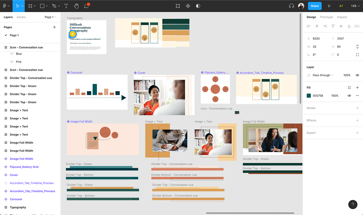
Pro tip: if most of your eLearning courses are authored in Rise or Storyline, create preset frames sized to the assets you’ll need. Our team created master components in Figma for different Rise components and Storyline slides. That way, we can export directly from Figma and upload them inside of our courses.
4. FigJam
FigJam is an online whiteboard for teams to ideate and brainstorm together. A browser-based tool, you can use FigJam to organize ideas, give feedback on design projects, UX, and anything else that calls for cross-functional innovation. FigJam is especially convenient if you’re also using Figma. FigJam and Figma function seamlessly together so that your work can live all in one place, from concept to design.
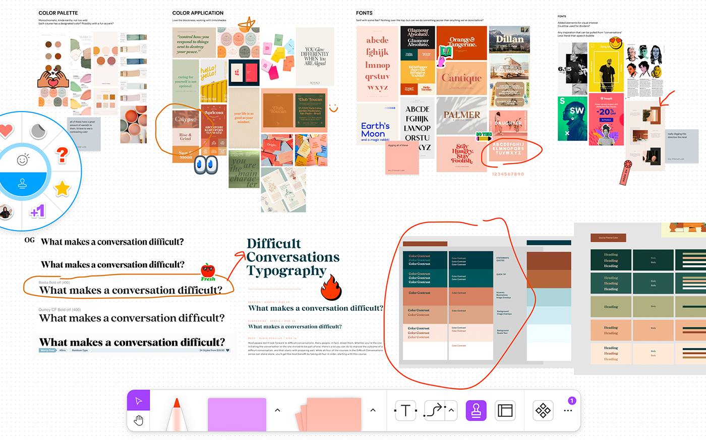
We use FigJam for meetings and brainstorms, especially when we’re collaborating virtually or asynchronously. FigJam is a great tool for everything from note-taking and organizing ideas to leveling up engagement through interactive features like voting, activity templates, and live chat.
We also love using FigJam to build moodboards. From ideation to internal review with clients, you can use Figjam to lay out your board, react to ideas using emojis and voting, and gather feedback using sticky notes and other interactive features.
FigJam is quickly becoming our tool of choice for thinking through and dreaming about how to push a brand or project further. With clients, we’ve used FigJam to establish and share a cohesive design preview and even share some of how their course content will look in Rise. This approach allows clients to visualize our direction and rationale—from graphic elements to typography—and understand trends that will resonate with their audience.
5. Adobe Photoshop
Adobe Creative Cloud has over 20 design-related apps. But when it comes to learning design tools, our favorites are Photoshop and Illustrator (more on Illustrator in the next section!).
Photoshop is the ultimate photo manipulation tool. Photoshop is our go-to when we need to remove backgrounds from images, clean up eyesores, or adjust photographs to match branding.
In Photoshop, you can manipulate even a generic stock photo for brand cohesion by applying cropping techniques, colored overlays, transparencies, and other graphic elements.
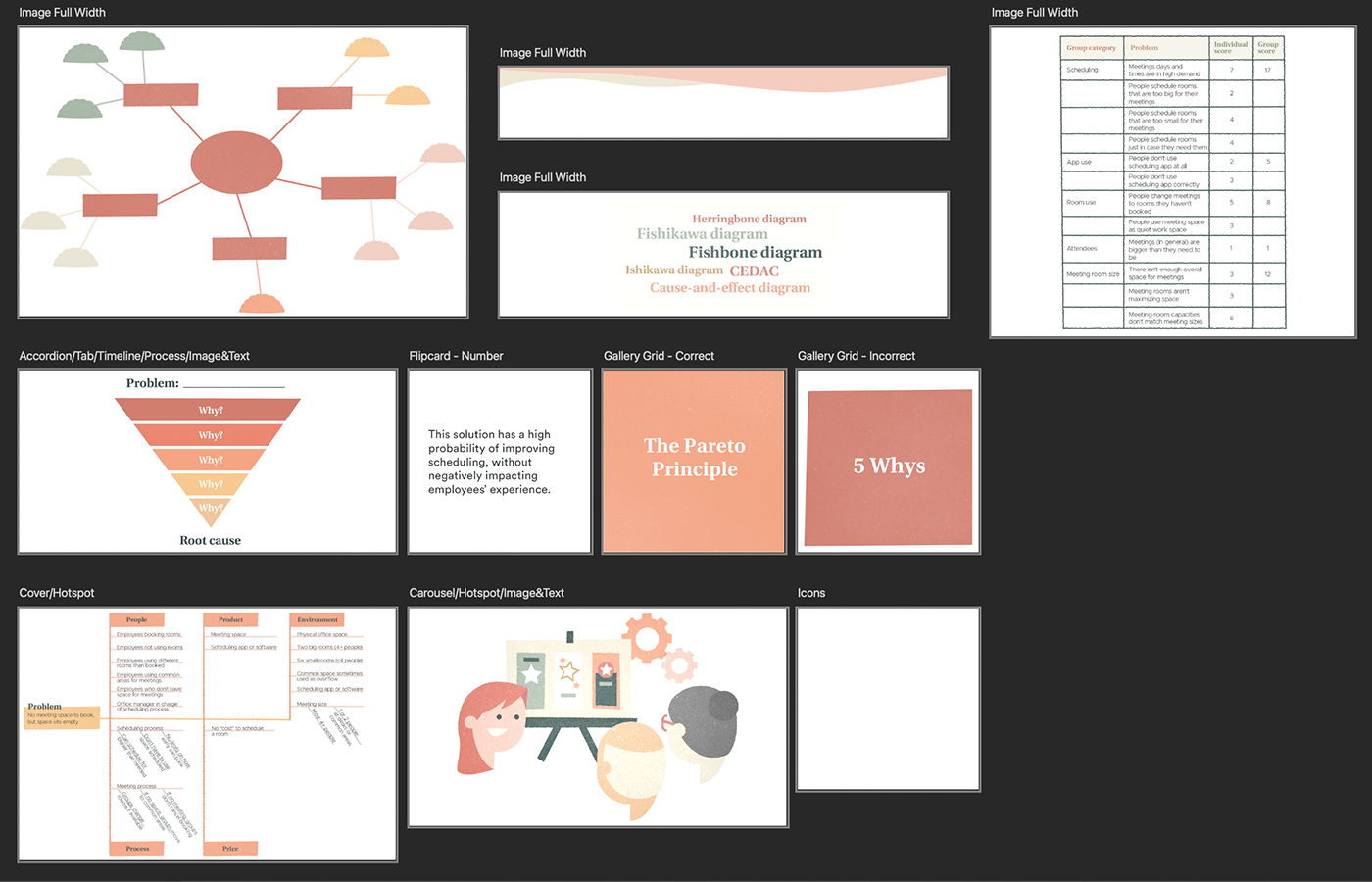
Similar to how we work in Figma, we use preset artboards in Photoshop sized to the different Rise and Storyline assets we need. That way, we can export images out of Photoshop and upload them directly into our learning projects—no dimension adjustments needed.
6. Adobe Illustrator
Adobe Illustrator is a design industry standard for a reason: it’s a versatile and high-quality tool for creating precise designs, Illustrations, and vector graphics.
We use Illustrator primarily to create custom illustrations and graphics. If you’re looking to make character or icons sets, graphs, or infographics, Illustrator is usually the right choice. Many of our courses incorporate motion graphic videos. Using a series of artboards in Illustrator, we create our characters, settings, and on-screen text as still imagery. Then we hand off our illustrations to our motion designers to import them into After Effects (another Adobe tool!) for animation.
What about Canva for learning design tools?
Illustrator can take some time to learn, plus you’ll need a subscription to use it—so what about Canva? This free graphic design and publishing platform helps make complex design easy. There are tons of templates to customize, or you can create your own design right in the tool. If you’re looking to create artboards for your courses, start by creating your own design and sizing it for your component. Then you can upload or create your image and download it as a PNG to include in your course (be sure to check transparent background if you need it!).
7. Getty Images
Every learning designer needs access to high-quality stock photos. There are several options for selecting great stock photography for your learning, and Getty Images is our top pick. With a Getty subscription, you have a huge variety of photos, vector-based illustrations, and videos at your fingertips. You can search Getty for the type of asset you’re looking for and in our experience, the database always turns up something worth downloading.
Although a Getty subscription can be expensive, other stock photography options are often way pricier—a single image can sometimes run you hundreds of dollars. If you’re working with stock photography often, it’s probably worth considering adding Getty images to your arsenal of learning design tools. In our case, the subscription is well worth it—our design and media teams use Getty assets in all kinds of creative ways across mediums and projects. Our advice? Work with a sales rep from Getty to get the best annual deal.
If a Getty subscription is out of the question, there are other free stock photography websites worth checking out. Our favorite is Unsplash—these photos have an artistic, high-quality, and global feel because photographers submit from around the world. You can also check out other free stock imagery sites like pexels.com and pixabay.com.

8. Flaticon
Many course development tools come with a high price tag. But there are free resources out there that can help enhance and streamline the learning design process.
Free graphic resources are a great way to save time on learning projects without sacrificing that professional polish. Freepik is the parent company for several projects. Our favorite is Flaticon, where designers can download free icons and stickers.
On Flaticon, you can search for designer-made icons, stickers, interface icons, and animated icons in PNG, SVG, EPS, PSD and BASE 64 formats. You can even search by author so that the graphics you download have a consistent, cohesive feel. A cool perk: you can also contribute your own designs to the Flaticon database and earn money.
Learning works best when beautifully designed
No matter the tools you choose to make it happen, great design is at the heart of an effective learning experience. Not just the beautiful visuals you create, but also the thought and care you put into designing a solution that truly serves learners’ needs.
Design is more than just decoration. We know that learning designers invest time and energy into understanding the right solution to build for their projects—and with the right design tools and apps in your toolkit, making great learning can be even more fun, efficient, and collaborative.
Learn more about how FigJam is a game-changing tool for learning designers.
Here’s how to use FigJam to brainstorm, collaborate, and dream bigger.
Read more→
