

Are you searching for Articulate Rise design ideas? You probably already know that Articulate Rise is the best tool for creating responsive eLearning. But in order to avoid creating a final product that feels cookie-cutter and underwhelming, you have to get creative with your Articulate Rise design ideas. That means thinking outside the box and pushing the limits of the platform to develop a truly unique and memorable Articulate Rise course.
How to create better courses in Articulate Rise
While it’s true that anyone can develop their own Articulate Rise course, here at Maestro, we like to take our Articulate Rise design ideas to the next level. When our interactive designers work in Rise, they look for ways to push the limits of the platform, even beyond the improvements in Rise Themes, to create the best possible eLearning experiences.
We appreciate Rise as a tool, but we also know that every tool has limits. It’s been our mission to stretch our Articulate Rise templates as much as we possibly can to create courses that stand out—from strategically designed transitions to custom illustrations that give each course a unique identity.
We know a thing or two about creating great Articulate Rise 360 templates and customizations that lead to beautiful courses. Here are our six tips for improving your next Articulate Rise course.
6 Articulate Rise design ideas
When it comes to eLearning solutions, Rise is a phenomenal tool for responsive, rapid authoring. But there are plenty of innovations in Rise that the typical user wouldn’t know about. Here are a few Articulate Rise design ideas you can implement in your next course to make it truly one of a kind. And if you find yourself wanting more, check out the Rise community forum for some other helpful insights.
1. Create seamless, more vibrant transitions
Trying to avoid that banded look that can often happen in Rise? Consider adding visual and graphic transitions to help move away from the straight horizontal line between two blocks with different background colors. With a little bit of creativity—plus Photoshop and Illustrator templates—your design team can develop images that bridge the gaps between two content pieces to create more interesting transitions. Pro tip: use a labeled graphic, instead of a full-width image block, to get the exact dimensions you need (so the sides don’t get cut off).
For this particular client, we created an image that contained the background colors of the previous and next content pieces and layered a photo with graphic elements on top. Make everything seamless by removing the image’s padding and you’re good to go!
![]() For access to exclusive resources like our Rise Image Dimensions Cheat Sheet—which helps creators like you design custom components in programs like Photoshop, Illustrator, Canva, and PowerPoint—we invite you to join our Maestro Community. This private online forum contains tons of tips and tricks from the team at Maestro—like how to create your own Articulate Rise templates—as well as insights from other learning professionals. Plus, it’s free! After you join, simply visit the Designing in Articulate Rise space and check out the pinned posts to snag your cheat sheet!
For access to exclusive resources like our Rise Image Dimensions Cheat Sheet—which helps creators like you design custom components in programs like Photoshop, Illustrator, Canva, and PowerPoint—we invite you to join our Maestro Community. This private online forum contains tons of tips and tricks from the team at Maestro—like how to create your own Articulate Rise templates—as well as insights from other learning professionals. Plus, it’s free! After you join, simply visit the Designing in Articulate Rise space and check out the pinned posts to snag your cheat sheet!
Designing in Rise just got better
Are you a learning designer who wants to do even more in Articulate Rise? Do you lead a team of innovative learning creators eager to explore new tools? Do you want to push your course design further? Meet Mighty, a powerful little Google Chrome extension that gives you access to exclusive features and functionality to improve your course design in Articulate Rise.
Learn more + sign up→2. Create labeled graphics with hotspots for interaction
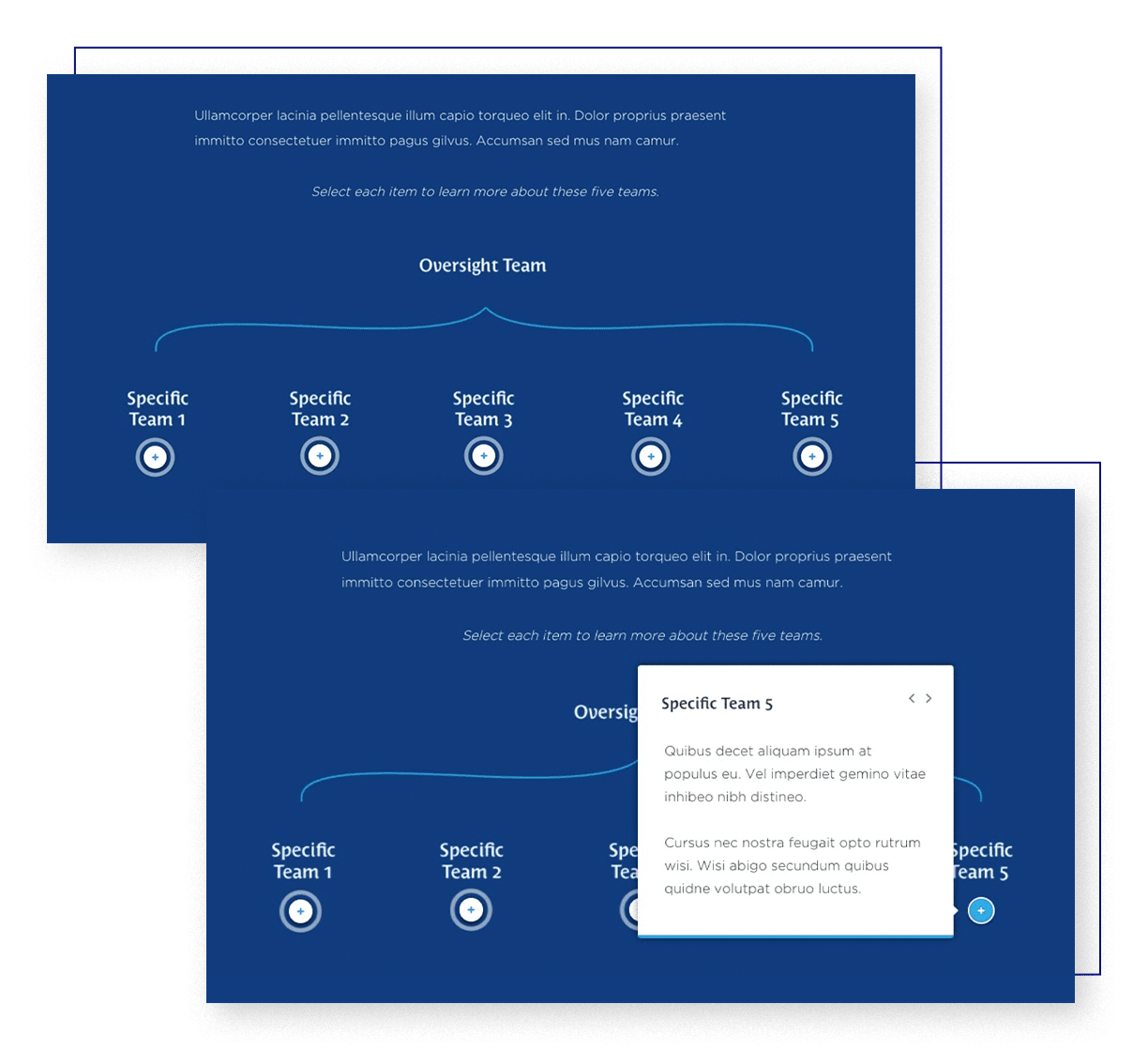
Rise has a feature that enables learners to select hotspots that trigger interactive elements and reveal more information. One way that we customize this further is by figuring out exactly where certain hotspots will be and marking them as a layer in our Articulate Rise templates. Once we design the graphic, we can remove the crosshairs, and when the graphic appears in Rise, those hotspots will be in the exact spots they’re meant to be on the image.
This allows us to customize the content to our client’s exact format specifications and stay true to their brand in every course we build. Watch this tutorial to learn exactly how to place hotspots when building labeled graphics.
3. Customize charts further with templates and in-app tricks of the trade
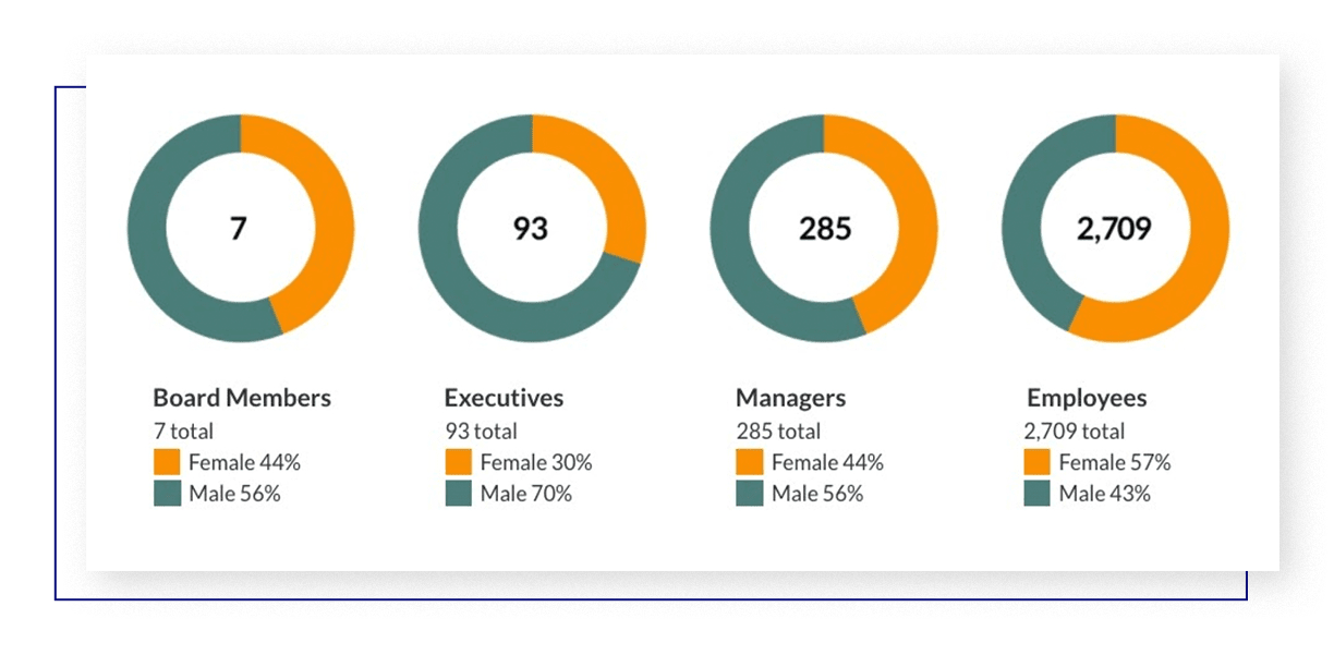
Rise does have the ability to create charts, but design options are limited. However, there’s an option for multiple charts to be used in one row. For this client, we created donut-shaped pie charts to display their content, placing each chart image into the four-column grid block.
The key below each chart was created simply using Rise’s formatting options for text. How did we add the colored boxes in line with the key text below the charts? We simply added an “x” before the text, changed the text color of the “x” to be the same as a section in the pie chart, and then changed the background color of the “x” to that same color.
The best part of a design like this is that it’s responsive. By placing each chart and key in its own column, it easily snaps into various layouts according to the user’s screen size for legibility and convenience.
4. Create custom iconography using closely cropped images
Rise doesn’t have a lot of options when it comes to icons, and even if it did, custom iconography is always the better choice. Our workaround? Our designers create custom icons on a square canvas, crop them closely, and save them at a size between 80×80 and 150×150 pixels. From there, these icons can be loaded and placed as images anywhere in your course.
![]()
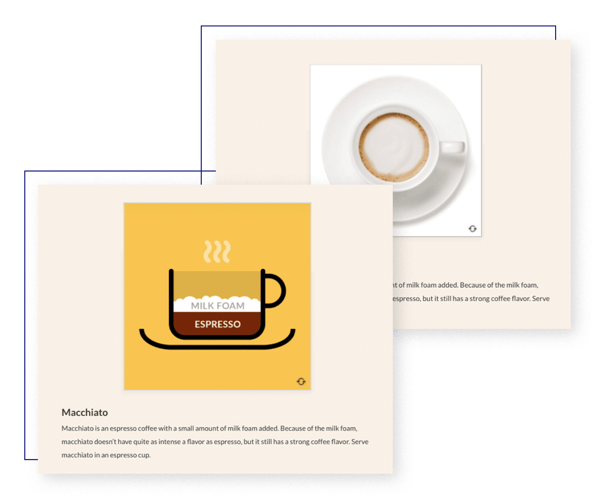
5. Make the most of Rise’s flip card feature
When we think of flip cards, the typical approach is to place an image or word on one side and the definition on the other. But what if you took the flip card in Rise and made it even more visual and interactive?
With this client, rather than placing a word and its definition on the card, we used the card to show an image of a macchiato with the information below. When the learner flips the card, they get an exact breakdown of espresso and milk foam ratios to make the perfect beverage.
6. Use design templates to customize photo elements
Because Rise has a set number of content blocks and styles to choose from, our designers have had to use their creative innovation skills to overcome certain design limitations, especially when images are involved.
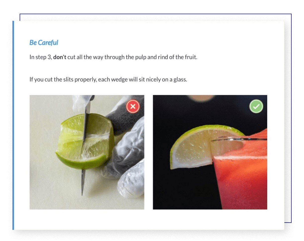
With this particular example, we wanted to incorporate side-by-side images showing the do’s and don’ts of slicing a lime for a cocktail. But since most Rise components only accommodate one image at a time, our designers had to think outside the box (literally). Using the accordion image dimensions, they created a single artboard in Photoshop, within which they placed both images (the “don’t” image on the left, the “do” image on the right). After that, they layered the corresponding icons on top of the images and exported the artboard as a singular, flattened image. And presto! Articulate Rise limits transcended.
Do’s and don’ts for developing your Articulate Rise course
You’re thinking outside the box, you’ve got an arsenal of insider tips and Articulate Rise examples—but there are a few more things you should know.
Grab your notebook, because we’re about to go over a few of the do’s and don’ts we’ve learned through our many trips down the Rise rabbit hole.
Do’s for developing in Rise
- Sketch out course chapters before jumping into the nitty gritty of designs. That way, any major transitions or graphic templates can be carefully planned and executed.
- Consider adding color behind accordion or timeline components to allow the white in those components to really stand out.
- Customize where it makes sense. Use color and brand collateral to make your course distinct and professional. But remember to keep accessibility and legibility in mind when selecting colors to go behind text elements.
- Incorporate custom illustrations and photos by creating your own Rise design templates and elements. Cultivate the look and feel of your course with a personalized, thoughtful design that connects with your audience.
Don’ts for developing in Rise
- Don’t overuse unnecessary components. Sometimes a text block component is all you need. Avoid using complex components just for the sake of interest. Forcing learners to use hotspots or flip cards when it’s not necessary can be distracting and confusing.
- Don’t overuse the same components. Be intentional, but don’t be repetitive. Using the same components over and over can make a course feel routine and stale. Remember that Rise is a scrolling experience—variety will help keep learners engaged and alert.
- Avoid extremely long chapters. Rise is designed to be a user-driven experience, but your design has to keep up. Whenever you can, separate your pages into bite-sized chunks so that learners don’t feel overwhelmed by content.
At Maestro, we know that learning works best when beautifully designed. By using these out-of-the-box Articulate Rise design ideas, you can create a truly unique eLearning experience that engages your learners and creates meaningful change.
Design with Us: An On-Demand L&D Workshop in Articulate Rise
Watch and learn as two of Maestro’s interactive designers bring an eLearning course to life in real time.
Start designing→