
When Articulate Rise 360 released Articulate Rise themes in 2022, our designers dove head-first into the updates to start exploring. Articulate Rise is one of our go-to authoring tools, so naturally we were thrilled to have a look around. Our designers tested every aspect of the themes upgrade, familiarizing themselves with the capabilities, limits, and contingencies so that you don’t have to. So, without further ado, here’s our in-depth overview of Articulate Rise themes.
What are Articulate Rise themes?
Veteran Rise users will know that prior to the release of themes, global course customization in Rise was pretty limited—notably limited to fonts, accent color, navigation, and course labels. But Articulate Rise themes takes customization to another level.
Now you can choose from three prebuilt and professionally designed themes: Rise, Apex, and Horizon. In addition to choosing from eight cover page layouts, you can also customize additional theme elements, such as navigation menu type, navigation button options, and lesson headers.
Now let’s dive into customizing Articulate Rise courses using themes.
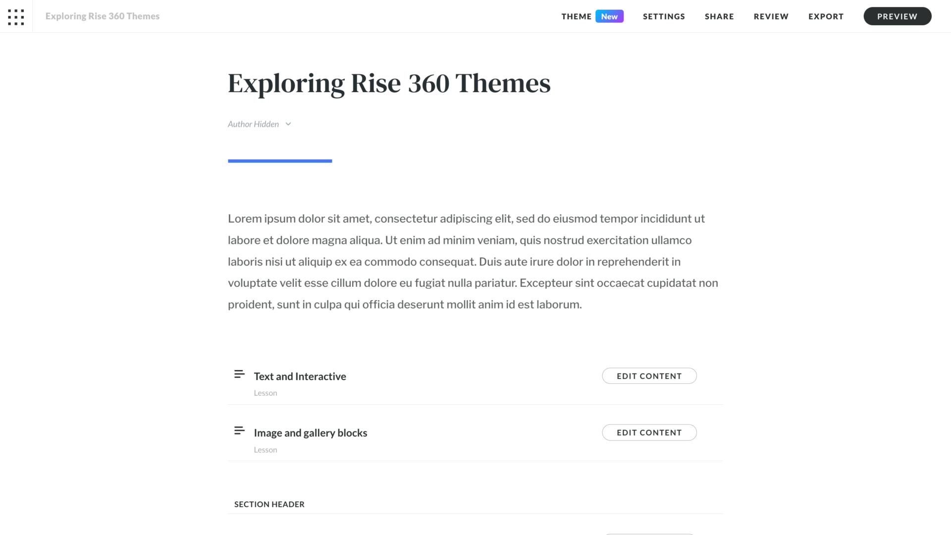
Articulate Rise Themes Settings tab
As we mentioned, the Settings tab now lives independently of the Theme tabs. You’ll see the Settings tab in the menu across the top of the intro page of a course, next to the Theme tab. Once you select Settings, you’ll see options for translations, labels, and collaborators. In this section, we’ll focus on translations and labels.
Translations
Translating Rise courses to different languages is easier than ever. This area of the Settings tab walks you through the four steps of exporting course text as XLIFF and importing translated text. The last step even reminds you to translate labels, buttons, tabs, and other navigational elements.
The ease of Rise’s translation functionality is an obvious benefit, especially because the process was pretty clunky before, but we do want to offer a word of caution. At Maestro, our best practice is to translate storyboards first—that way, it’s easier to find and make small updates, document versions, and work collaboratively across workspaces on an easy-to-use platform, like Google Docs.
Labels
Currently, the built-in languages in Rise are English, French, Spanish, and German. But more languages for built-in label sets are coming soon. To translate all your labels at once, you can upload a XLIFF file to Rise and let technology do its thing.
What’s still on our label-settings wish list: the ability for custom label sets to follow a course to different authors. Right now, if you send a copy of a course to an author in a different workspace, the custom labels don’t transfer. You’ll need to provide a list of label translations for the author to enter on their end.
Articulate Rise Themes
Moving on to the Themes tab, you’ll be able to explore subtabs including Cover Page, Navigation, Lesson Headers, Colors, Fonts, and Blocks. This is where the magic happens—Themes is your sandbox for designing a unique and customized course. Let’s get into it.
Theme
This is where you select from one of the three themes. First, there’s Rise. This Articulate Rise theme is modern, clean, and timeless. Next, there’s Apex, which is designed to have a bold and contemporary feel. The third theme is Horizon, a more elegant and stylish option with little flourishes that truly make your course stand out. If you’re undecided on a theme, check out the live preview of each theme as you consider each option, and choose the one that speaks to you.
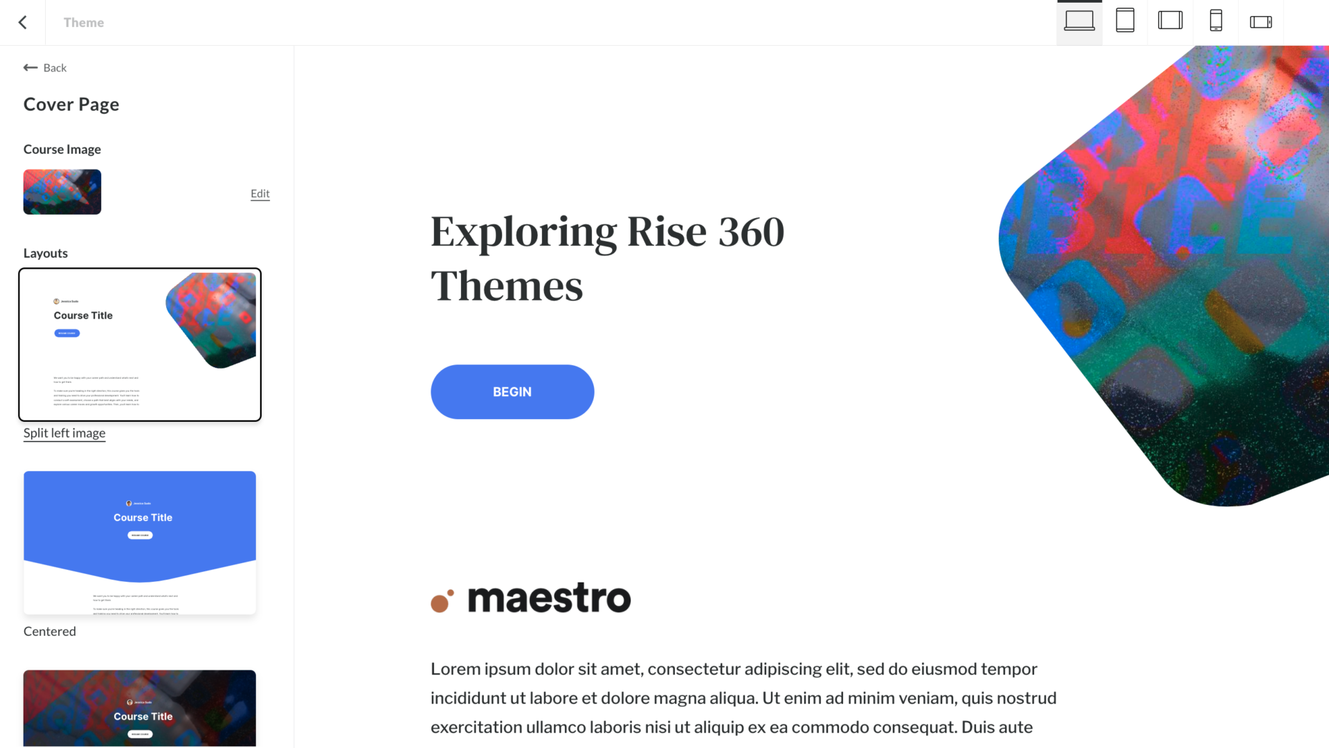
Articulate Rise Themes: Cover page
Rise offers eight unique cover page layout options for each of the three themes. There are plenty of beautiful layouts to choose from, and once you make your choice, you can then add further customizations. Within the Cover Page tab, you can upload and replace images from your desktop or Articulate’s content library, adjust text contrast, and upload a logo.
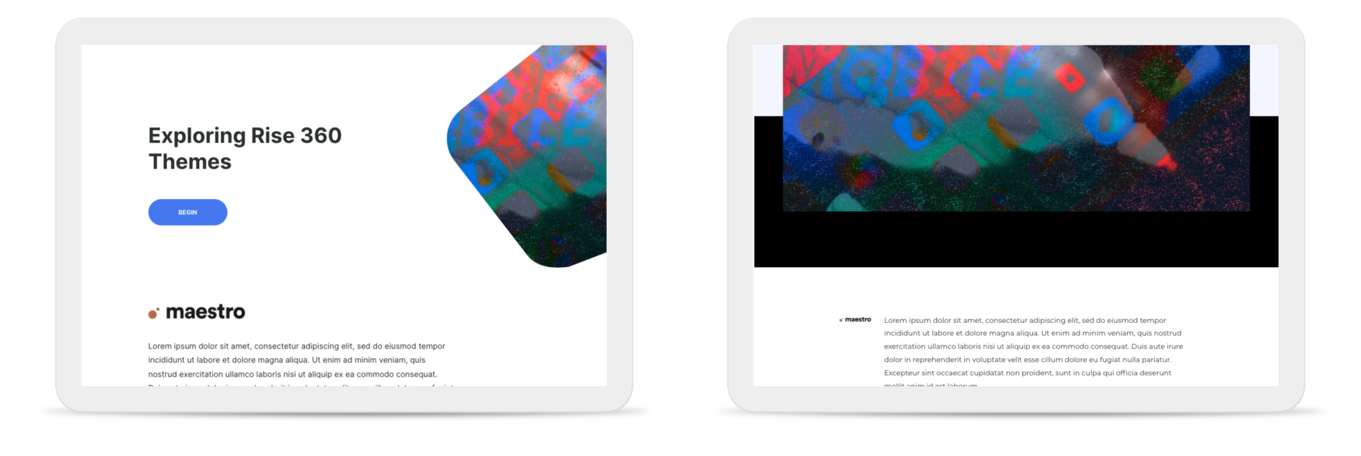
A note on logo placement: in Rise and Apex themes, the logo appears above the cover-page text. In the Horizon theme, the logo appears to the left of cover-page text when viewed on desktop and horizontally on tablets, but moves above cover-page text when viewed on vertical tablets and both mobile views. To make this left-of-text position work in the available screen real estate, the maximum logo width is much more narrow than in Rise or Apex. The more horizontal the logo, the smaller it will appear on screen, which may impact its legibility.
You can also crop your uploaded images directly in any Articulate Rise theme. While that’s a convenient feature, we prefer to work in Photoshop, Figma, or Illustrator using the preset frames that we’ve optimized for the different blocks. That way, we can also make other enhancements to the images while determining the best cropping.
Articulate Rise like you've never seen it before
When you love something, you want more of it. That’s why we created Mighty, a powerful little Google Chrome extension that helps us (and you!) do more in Articulate Rise. If Rise is your go-to authoring tool, Mighty has the features and functionality you need to level up your visual design, increase your efficiency, and create better learner experiences. Want to see all that Mighty can do? Start your free trial now!
Learn more + sign up→Navigation
Type
You can customize the type of navigation menu for your courses and choose from multiple color options. While there have always been options to show, hide, or disable sidebar navigation, you now have several more ways to customize how learners navigate courses. To explore your options, you’ll choose Navigation. From there, you can choose the Sidebar option (the original menu format), Compact, Overlay, or remove navigation completely.
Compact
The Compact option puts navigation in the corner so that your content is the main attraction. When learners need to access navigation, they can click to expand it. Our opinion: we like that this option minimizes the real estate used by the menu when it isn’t needed, and it does impart a dimensional element. It’s worth noting that the Compact option only appears on desktop computers or horizontally oriented tablets, and reverts to the Sidebar option in all other responsive views.
Overlay
The Overlay option is a full-coverage navigation panel that learners only see when they select the hamburger icon (☰), triggering the nav to slide down from the top of the screen and overlay the lesson.
If you’re opting for the Overlay option, there are two things you might consider. First, keep in mind that selecting the image option for Overlay means that the customization choices you made for the cover page layout—like the image and the text contrast percentage—will carry over here. Be sure to select a text contrast percentage that allows for optimal legibility in the menu.
Second, know that in the Horizon theme, menu text is centered. If the course menu includes section headers or has many lessons, use the preview option to evaluate for legibility—Overlay may not be the best choice.
Buttons
There’s a lot of fun to be had with button customizability in Rise. This is great for tailoring the learner experience and building an on-brand course. Now you can choose between full-width or floating Previous and Next buttons, or you can even opt to turn them off entirely. You can further customize buttons with different color schemes and options for accent colors or tints.
You’re likely already familiar with Full-Width Previous and Next Buttons—that was the standard in Rise for a while. But the Floating Buttons option—which creates buttons that appear on the right side of the screen and float into view from the top or bottom of the lesson as learners scroll—is another great choice.
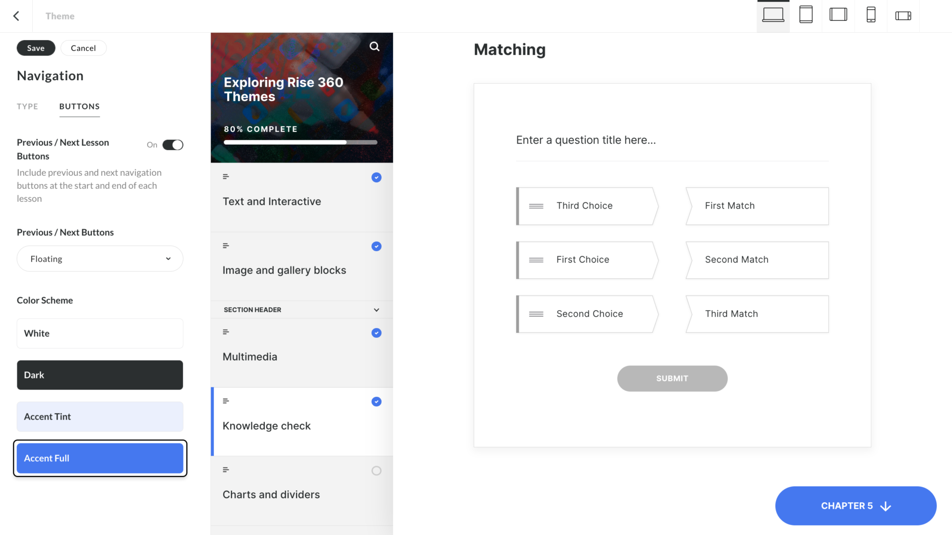
Wondering about the responsiveness of Floating Buttons? In a vertical view on mobile, they appear as a hybrid between Floating and Full-width Buttons. But in all other responsive views, Floating Buttons look clean and manage to avoid the banded look that can often happen in Rise.
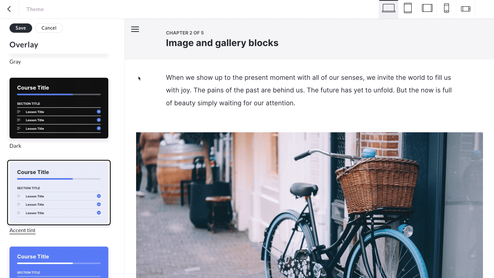
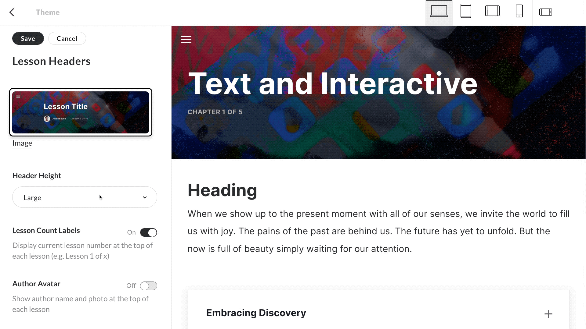
Lesson headers
We love customizing headers, so we’re excited about this one. When designing your lesson headers, you can choose from a preset light, gray, dark, or accent color background. If you’re going the customization route (we are!), select a custom background color, in which case the lesson header text will automatically change from charcoal to white based on the contrast with the background color.
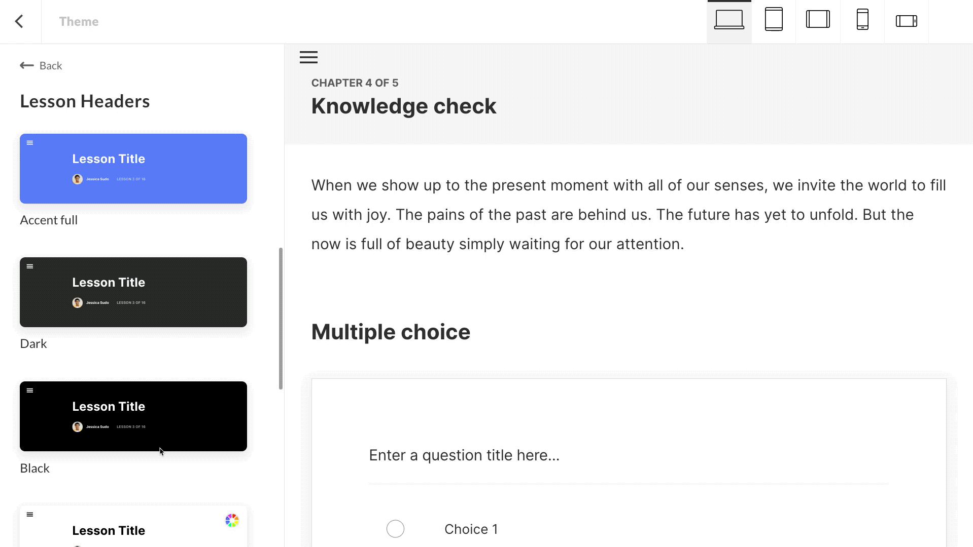
Why we love this: it’s a great way to add a secondary brand color to your course. That said, keep in mind that a bright, highly saturated color may draw too much attention to the header and away from the content. If you’re dealing with a bright color, consider using the small lesson header instead.
You can also choose to use an image as the background for your lesson header. Note that whether you opt for a color or an image, the choice will be consistent across all lesson headers in the course.
Finally, you can also make lesson headers taller or shorter by adjusting header height. This feature was a game-changer for us, and we use it all the time. Here are a couple best practices we’ve picked up along the way: When using the small header height, we recommend pairing it with floating navigation buttons to avoid confusion between the header and the Full-Width Navigation Button. Create further clarity between the lesson header and navigation buttons by making sure that the buttons are a different color than the lesson header.
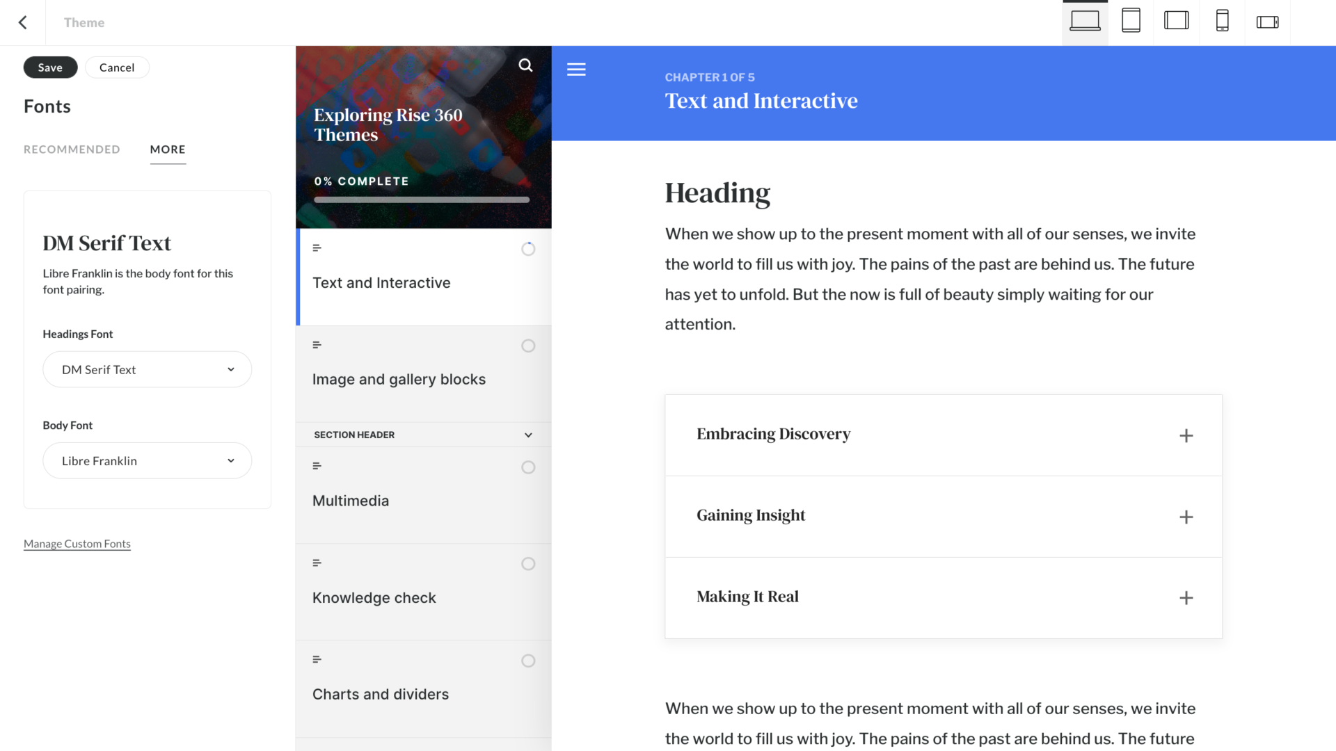
Fonts
Here you’ll find new recommended pairings of headings and body fonts. There are seven pairings—three options that have the same font for heading and body copy and four options that have Serif/Sans Serif pairings.
Interactive designers and those who need to adhere to brand guidelines likely won’t use this feature much, but for others, especially those without graphic design experience, the pairings are useful. There are more fonts to explore in the More tab and, like before, there’s also an option to upload and manage your own custom fonts.
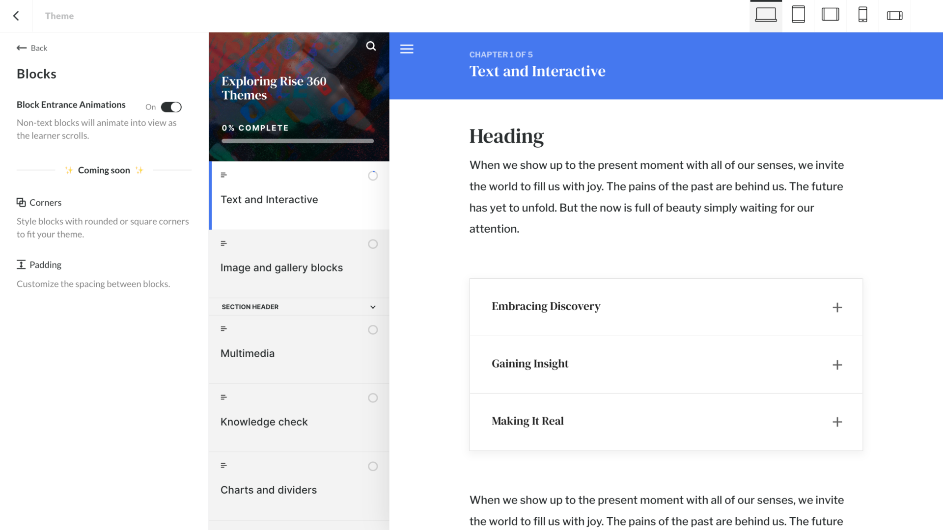
Blocks
Under the Blocks tab, you can turn on block entrance animations so non-text blocks will animate into view as the learner scrolls.
We hate to end on a cliffhanger, but some of the most exciting updates coming to blocks are yet to be released. Coming soon, we’ll have Corners—a new style of blocks with rounded or square corners to fit your theme. Rise is also teasing a Padding option, which we’re hoping will have settings to globally customize the spacing between blocks. That could be a time-saver if you’re like us and often adjust the default block padding.
Customization leads to better learning experiences
We love designing learning experiences in Rise—it’s clean, responsive, and helps deliver a user-centric learning experience. With Articulate Rise themes, there are countless ways to customize your courses to both enhance learning and keep the experience on-brand.
Now that we’ve given you a tour of the Articulate Rise themes, go explore how you can push the limits of the platform and design Rise courses that stand out. There are endless opportunities to customize, create, and innovate within Rise. Happy designing!
Discover the secrets of Rise and make your courses stand out
Are you ready to transcend the limits of Articulate Rise with some good, old-fashioned creativity? Watch this webinar in which our interactive designers walk you through just how they push the limits of Rise with design tips, tricks, and out-of-the-box solutions.
Unlock the Secrets of Rise→